
Sunday, 10 April 2011


The Base: Evaluation
In what ways does your media product use, develop or challenge forms and conventions of real media products?
My magazine was based on hip-hop music and I was aiming to create a magazine that was different yet similar to other magazines of the same music genre. There were many elements of hip-hop music magazines that I noticed whilst researching music magazines and these were incorporated into my magazine, but there were also elements I added that can be seen as challenging the structure and layout of a typical hip-hop magazine. Firstly, the placement of my masthead was influenced by Respect magazine where the masthead is placed at the top and takes up the whole width of the top part of the page. I used this style in my magazine because I feel it looks very strong and clear. Respect magazine also influenced the use and layout of text on my front cover for all the sub-articles. In Respect, the article titles are placed around the edge of the magazine so that the focus is on the image of the cover artist. I used this style in my magazine, with the cover articles around the edge in white font, being careful that the text doesn’t overlap onto the image of the artist. By doing this, I challenged the convention of Hip-Hop Weekly, because on the front cover of their magazine that I researched, text often overlapped onto the image of the main artist, however I feel that this makes the magazine cover look cramped. With regards to my contents page, I feel I heavily incorporated the styles of hip-hop magazines because hip-hop magazine contents pages are extremely different in the layout and structure of other music magazines. When carrying out my research, I realised that hip-hop magazine contents page are very vague and when first looking at the contents pages, it’s not clear that it’s a contents page because there is no title saying so. I didn’t like how they used this in both Hip-Hop Weekly and Respect, therefore I chose to have a title saying ‘Contents’. However I still wanted to have the unusual layout of hip-hop contents pages so I placed my contents page vertically down the left-hand side of the page. An element I did like about the hip-hop contents pages I researched was the layout of text. The text was chronologically ordered and structured in neat columns, with each page summary having a fair amount of text. I wanted to incorporate this into my magazine because I felt it worked really well so I laid out the text on my contents page in a chronological order and placed it in columns like Hip-Hop weekly. With my pictures, I decided to only use one picture because with Hip-Hop Weekly and Respect, only one or two images are used and there is more text than images so this idea has been included in my work.
How does your media product represent particular social groups?
My music magazine is for the hip-hop genre and this type of music is stereotypically listened to by young people. Therefore it is important that when I was making my magazine, I remembered my target audience and their interests. Colour is a very key element of a music magazine and although it often goes unnoticed, it is the main thing that catches a readers eye. For example, if the colour scheme of my magazine was bright, loud, pastel colours, that would typically attract a younger audience and be related to the pop genre. The colour scheme used in my magazine was predominantly black, red and white. I used these colours because when carrying out my magazine research, I noticed that hip-hop magazines mainly used dark, block colours so I used this in my magazine as well. The mise-en-scene of the pictures also would attract hip-hop listeners as they are wearing dark, hooded jumpers which is again associated with the hip-hop genre.
What kind of media institution might distribute your media product and why?
When it comes to distributing my magazine, it’s key to choose a publisher that has worked with media products that relate to the product you are making. Therefore I would choose IPC Media to distribute my music magazine because they have previously published Vibe Magazine, before the magazine ended. If the publishers have worked with similar types of products to yours, then it is clear they know how to accurately target and distribute the product.
Who would be the audience for your media product?
The audience for my magazine is very specific because they have to be interesting in what I am making. My target audience is predominantly males aged between 16-21, therefore it is important that I include elements that will keep this audience interested. I chose this audience as my target audience because my questionnaire results carried out for research showed that hardly anybody below the age of 16 would buy a hip-hop magazine and mainly males took an interest into buying a hip-hop magazine.
How did you attract/address your audience?
Carrying out a questionnaire was extremely useful because it helped me to know what to include in my magazine, what hip-hop listeners like to see, and how to grab their attention. The main element that would attract my target audience would be the use of colour. I chose the colour scheme of red, black and white because they are dark, plain, bold colours that easily catch a person’s attention and especially when those colours are associated to the hip-hop genre. Also the pictures I took were used to attract the audience because the mise-en-scene is very important because hip-hop listeners feel they can relate to the people on the cover in regards to what they are wearing etc. Also the use of text on the front cover, contents page and double-page spread is very important because it must be understood by the audience. If I were to use extremely formal language throughout my magazine it wouldn’t clearly relate to the genre of music, whereas if I were to use text that related more to the hip-hop genre, the readers would feel more comfortable reading it.
What have you learnt about technologies from the process of constructing this product?
Many different technologies and software’s were used to help me create my magazine and also to carry out my research as well as display my research. www.blogger.com was the website used to display all my research carried out as well as to record my progress with my magazine. www.slideshare.net and www.surveymonkey.com have helped to upload my presentations and questionnaires in a clear, effective way. Both have helped me carry out my research and display it clearly, and therefore make key decisions with the making of my magazine. Photoshop was the main editing programme used to construct my magazine, and the process of making my magazine has vastly helped me to navigate my way around Photoshop and after this, I feel much more confident about Photoshop. When taking my pictures I used a SLR camera to take my pictures to ensure my pictures were of a high quality.
Looking back at your preliminary task, what do you feel you have learnt in the progression from it to the full product?
When constructing the magazine for the preliminary task, my knowledge of the editing software Photoshop was extremely limited, this therefore limited my ability to make a decent front cover. In comparison to my preliminary task, I feel my music magazine is better and I feel my Photoshop skills have come a long way. When looking at both covers, a noticeable difference is the quality of the photos used because with the preliminary task, a digital camera was used to take pictures and with the music magazine, a SLR camera was used which evidently shows higher quality. Another development made since the prelim task was the use of font. With my prelim task, I used very basic, ineffective font that created a childlike effect however I feel I have improved with fonts and now the fonts add to the impact of the magazine. With the contents page, I feel my preliminary contents page looks very rushed and unorganised, however with the music magazine contents page it looks more organised and ordered which is what I was trying to attempt because it related to magazines I had researched.
The Base: Inspiration for my Magazine
Attached are videos from artists that have inspired my music magazine. These artists are part of the hip-hop/rap genre which is the genre my magazine is based on, and these artists are the type of artists my readers listen to and therefore they have been included to attract my readers.
The Base: Double Page Spread Progress


This post is to track the progress of the production of my double page spread for my music magazine, The Base. With my double page spread I did not make many vast changes in comparison to my flatplan because I was generally happy with the layout, use of colour etc. and did not make many changes. I liked the layout of images and text and the only few changes were the layout of the standfirst and headings. I was most confident with this final product and I feel it is my strongest out of all three.
The Base: Contents Page Progress


This post tracks the progress of the production of my contents page for my music magazine, The Base. As you can tell, there were not many vast changes with my contents page production, however I feel the small changes that were made, made the contents page visually much better. The use of images on my contents page were the main changes carried out, I felt my images were not strong enough to use on my contents page. With regards to the photo in the top-right hand corner of the first image, the photo of X2 is too similar to the one used on my front cover and its important to have different shots etc. so i changed the photo. Also with the photo of the female, it was not strong enough so it was removed and replaced with text. Overall I felt that the changes made were for the better and enhanced my final product.
The Base: Front Cover Progress


Tuesday, 29 March 2011
The Base: Double Page Spread X2 interview
X2 represent everything that’s right with the youths of London today. Together Ali & Zack have fought the stereotypes that listening to rap music makes you a thug, being young makes you naïve, and not being in college makes you a dropout. However, these two quick-witted young men are fighting all types of obstacles to be where they are now. And they show no signs of slowing down.
So how did you guys start off making music?
Ali: Well I always used to write and had books and books full of lyrics in my bedroom. The problem was I didn't have access to a studio or any sort of musical equipment. Due to this, I naturally assumed my lyrics would always stay like that. However, one day a friend introduced me to a guy called K2 who just happened to have a studio in his house and he lived quite close to me. I couldn't believe it! He invited me to his house and I bought Zack along and we recorded something of the top.
Zack: Yeah I mean we naturally got along with K2 and it ended up with him not only being our producer but also like a brother to us, we wouldn’t of got this far without him.
What or who inspired you to start?
Zack: For me it all started in year 7. I know its kinda young but this was way before I knew anything about the genres of Hip-Hop or Rap. Me and my mates would always be trying to rhyme random sentences together. Instantly I found myself quite good and quick at it.
Ali: I was kinda the same, I used to have rap battles at lunchtimes, get good grades for poetry homework and generally being known as the "rapper" in school. I found myself enjoying this new found talent a lot. So I started writing what I was thinking and expressing my feelings through rap. My thoughts soon turned to words, words turned to sentences and eventually, those sentences got structured into versus and hooks and turned into songs.
Zack:[Laughs] Haa, he makes it sound like a machine!
So you two seem to really connect well together, how did this friendship start?
Zack:[Laughs] Haha yeah…we didn’t really get off to the best of starts…to be honest I was kinda jealous of this kid, like I remember sitting there thinking “Damn! This kid is better than me!” But my jealousy soon turned into inspiration, I really wanted him on a track of mine, and he was down so it went from there.
Ali: Its weird that he says that because like, he’s older than me, and lyrically better than me, so when he asked me to work with him on a track, of course I was down, I mean who wouldn’t be?
So if you two hadn’t met and weren’t making music, what would you be doing with your life?
Ali: I used love making money as a kid. So I would probably channel that interest in some sort of business or something.
Zack: Apart from the whole rap game, I always loved biology, I know it sounds unusual but I was always fascinated by that sort of stuff so I would probably be doing something in that area.
When you’re both writing bars, what’s the process?
Ali: If someone has asks us to jump on a track they would usually have a topic from which all our bars would bleed out of. If I'm writing on my own I usually don't have a concept or beat at all. I just write what I'm thinking and then those bars get made into a song, then Zack adds his verse and that’s how most of our songs are made.
Zack: Yeah I mean when I’m writing, when something inspires me, like something that has occurred that day. I need to write it down that instant otherwise I know I’ll forget it
Ali: Shockingly…
So what inspires you to write?
Zack: Anything and everything in life. That can range from memories to people or experiences to current events. I’d say recently a lot of things have been inspiring us to write, like we’ve had a tough time trying to do what we love and like, you can only imagine the struggle we’ve had to get here. So stuff like that definitely helps.
Ali: Yeah definitely like every single life experience can be turned into a line, sometimes we surprise ourselves because the most average of days would help us to write a sick verse.
What artists/groups do you have on your iPod?
Zack: Me & Ali have literally exactly the same taste in music, you wouldn’t be able to tell whose iPod was whose but you would find all sorts, from Usher to Chipmunk, Raxstar to Bow Wow and 2pac to Jay Sean!
If you could support ONE artist on tour, who would it be?
Ali: If I could support someone on tour, It would be Jay Sean. He's a guy I really look up to and he inspires me a lot for what he's achieved.
Zack: Ali stole my answer! Its mad how we have the same taste, but yeah its cause Jay Sean has a similar background which is why he inspires us, so yeah, same answer.
Lastly, if you if you could collab with any artist in the world, who would it be?
Zack: Ahhhh that’s hard, If I could collab with anyone on the planet, it would have to be Drake or Eminem. Those guys are two of my favourite rappers and a collaboration with any one of them would be a dream come true.
Ali: Hmmm I would say the same except instead of Drake, although he is insane, I would say Dr. Dre. To have Dre produce a track of ours would blow my mind, he is a genius.
Thanks to X2 for their time, their debut album “Intuition” hits stores 24th April 2011.
Tuesday, 22 March 2011
Pictures for Magazine: The Base
For our music magazine, we were asked to take photos for the main focus of our magazine that would appear on the Front page, Contents page and Double page spread. I took a wide range of photos, with some that are not going to be included into the magazine but the ones that have been submitted into the music magazine will be seen here.
Front Cover

Contents Page

Double Page Spread - Main

Double Page Spread - 1

Double Page Spread - 2

Double Page Spread - 3

Wednesday, 23 February 2011
Flatplan Evaluation: Double Page Spread.
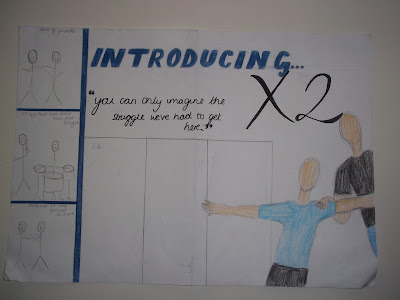
This is the double page spread I created that will hopefully be the one that I use in my magazine.
I really like the general layout of this double page spread because it looks quite original and I haven't seen articles that look like this. The colour scheme I am using here still uses the dark blue seen on the front cover and contents page, but also uses white because that is a light colour that isn't too loud but can also be associated with hip-hop. Black is again also used for all the text because using those three colours leaves the double page spread not looking cluttered and also has a nice effect.
The layout of this double page spread is interesting because of how the images have been placed. The big main image has been placed in the bottom half of the right-hand side of the page. It looks like the artists are creeping out from the side of the page which I think looks good. The arm of the artist is extended across the area where the interview will be placed however because the arm is light-skinned, the black of the text will be layered over it without affecting the look of it. The title of the double page spread 'Introducing X2' takes up most of the top of the page, without looking too empty. I like the clash of fonts with the block style of 'introducing' being layered under the calligraphy style of 'X2'. The three images on the left-hand side of the page create the look of negatives of developing photos which i like. Also in the three boxes, the artist are doing different poses which is easily portrayed without taking up too much space. For my double page spread I didn't use much inspiration from other hip-hop magazines, the most i took from it was the simplistic, ordered layout and that was about it.
Flatplan Evaluation: Contents Page.

This is my contents page I have created for my hip-hop magazine. Firstly, the background colour is the same as the front page because i wanted there to be a sense of continuity and also this is something that the magazines I researched had. The colour scheme of blue and black is a colour scheme I will carry out throughout all the pages because these are colours related to hip-hop and is something I noticed during my research. However there are two images with a white background because i wanted to bring some light to the contents page because i felt it would of been too dark and grim and white is not too much of a loud colour. The page numbers are red because that is another colour that is used but not as heavily as the black and blue. Red is another colour that is commonly used in hip-hop magazines.
The fonts used is again the same as the front cover to create a sense of continuity. The font used for the word 'contents' is the same as the front cover however it only looks different because it is vertically aligned instead of horizontally. I think that having it horizontal breaks up the page and gives it a different dynamic to what you usually see on contents pages. In my magazine research i noticed that 'Respect' magazine doesn't even have a clear contents page, therefore this is my way of breaking the norm of contents page layouts. The font used for the contents page titles will also be the same as the front cover because it is simple and easy to read. Italics have been used for the captions of the images as this is a common theme for magazines.
I feel that the layout of the magazine is well laid-out because it does not look too cluttered. Something i noticed during my research was that hip-hop magazine contents pages are all chronologically ordered instead of scattered around like a pop magazine. Therefore i incorporated this in my contents page to create a sense of order and organisation. The contents page is split into two columns which makes it look neat and the images are placed at the bottom left and top right corners so that they are not so near each other and again looks neat.
Flatplan Evaluation: Front Cover
This is the magazine flatplan for my magazine called "The Base". I created a front cover, contents page and double page spread flatplan so that i know how my magazine will be laid out and the colours etc. for when i make my magazine. I used the hip-hop magazines "Respect" and "Hip-Hop Weekly" to research and help me produce my flatplan.

This is the front cover for my magazine "The Base". The colour scheme was inspired by "Hip-Hop Weekly". I chose to use a dark blue as the background colour because firstly hip-hop music is related to dark monotone colours instead of bright, loud colours associated with pop-music. Also if the background was very bright, it wouldn't attract the target market I am trying to aim because typically hip-hop listeners are not attracted to bright colours. I chose the black for most of the font because black is the main colour associated with hip-hop music and I felt that the colour had to be incorporated somehow because black was used vastly in the magazines I researched. I do feel that in this flatplan, the black is slightly washed out by the dark blue however I feel when I produce it, this won't be the case. The reddish-orange colour used for "X2" is to attract the readers attention to the cover artists of the magazine. This is the main part I am trying to appeal to my readers and this is why this is the only bright colour used. Also, I layered the reddish-orange colour on top of the light blue t-shirt because it would stand out most against that colour. For the clothes of the artists, I used neutral colours that are not too bright or loud because I didn't want to defer the attention away from the group name "X2" and also because again, bright colours are not associated with hip-hop and also in my research, I noticed that particularly "Respect" had their artists wearing clothes that blended into the background.
The font that i would like to use in my magazine cover is not how it seems on this cover because this is just my usual handwriting, however I plan to use a font similar in the sense that it is very simple yet bold. This is how the fonts are in the magazines that i researched. The font used for the pull quote will be the same as the rest of the cover however it will be in italics, as that is usually how pull quote fonts are in most magazines. I wanted to use a very bold square-type font for the masthead, as this relates to "The Base" and is very bold yet simple. In my magazine research I noticed that mastheads remained simple yet effective, the colour of the font was often black therefore I incorporated that into mine.
The layout of the cover I think works well because it is not too cramped and not too empty. I did have a slight problem when placing the article titles because of where i had placed the selling line and I didn't want to cover up the top half of the artists body. However I think that it worked well and with a few adjustments like moving "X2" to the right it will open up the page a bit more and look a little less cramped. I noticed when carrying out my research that 'Respect' had all their article titles placed strategically around the edge of the page so that the focus was not taken away from the cover artist. I tried to incorporate this into my work. Also I have not included a button because no other hip-hop magazine uses a button therefore I did not use one because i feel it gives a slightly less formal look to the magazine.
Friday, 11 February 2011
Contents Page Analysis - Respect & Hip-Hop Weekly

At the top left-hand corner of the page it says "Order of Operations" which can be related to as the contents page. The text is neatly laid out in neat columns in chronological order instead of all over the place. This makes it easier for the reader to find the articles they are looking for.
The colour scheme of the contents page is very dark and bland. All the text is white, which has been layered on top of the dark colours of the artists clothes. The colours relate to the hip-hop genre because it is not related to bright, loud colours like in a pop magazine. The image used is of the cover artist Woka Flocka Flame, this is continuing from the cover of the magazine to show continuity of the theme of the artist.

This is the contents page for Hip-Hop weekly, and from a first glance this looks more like a contents page in comparison to Respect. The layout instantly gives off the feel of a contents page with two main columns, again chronologically ordered to make it easier to locate articles. There are two images on this contents page, however they are not of the cover artists, but instead of artists that are not the main focus but gives the reader the chance to locate their article. Both images are distanced from each other so that it does not look to cramped.
There is no over-crowding, the layout is extremely neat and organised. The most text is for the summary of the articles for the three main cover artists and after that, there are short sentences to summarise the remaining articles.
The colours used are mainly red and a washed-out light brown colour, which compliment each other. The red is used for the page numbers which stand out and is easily read against the washed-out brown of the background which is carried out throughout the rest of the magazine. There is no title saying Contents Page, or anything of that nature therefore it is not 100% clear that this is a contents page. However the general layout makes it obvious that it is.
Both contents pages show two very different styles of laying out a contents page, however there are also many similarities which can be related to the hip-hop genre such as the chronological order, the organised layout and the simple colours. This will help me to know what to include and what not to include in my contents page.
Tuesday, 8 February 2011
Double Page Spread Analysis - Respect Magazine
Here i am going to analyse two different double-page spreads of Respect music magazine in order to understand how to lay out my own double page spread, and to know what and what not to do.


J.Cole Double Page Spread Analysis

In this double page spread, it features hip-hop artists J.Cole. This can be seen with a big 'J' in white to catch the readers attention and it also ties into the start of the article. The article itself starts of with the rule of 3 'J.Cole hates telling Jay-Z stories. J.Cole is private. He's protective of his own personal and professional life.' it sounds catchy and hooks the reader to read on so that the three solid facts mentioned can be explained. Aswell as using the rule of 3, alliteration is also used for the same effect as the rule of 3; to hook readers and sound catchy. The article has a chatty flow to the conversation to make the reader feel relaxed. Italics are used throughout the article to represent the thoughts of J.Cole. This creates a one-on-one atmosphere for the reader and as if they are having a conversation with the artists. The writer also used simple, short sentences to create a sense of interest from the reader's perspective 'But you couldn't blame Cole if he was a tad distracted'.
Moving onto the image used, the image of J.Cole ties in over both pages therefore linking the image to the article and making it flow easier. His angle of gaze seems to be away from page instead of looking straight at the camera, this creates quite a reflective image. It gives off the impression that he is quite thoughtful. His body language seems quite comfortable and relaxed as he is crouched over. The artist is wearing a dark red jacket with a black t-shirt underneath as to not disturb the calm atmosphere with bright, loud colours. The dark red of the jacket complements the dark background well, it is mainly dark brown which is quite calming to look at. There are also faded, blurry lights in the background which has subtle and soft effect on the interview. The dimmed, soft lights and the entire background as a whole creates a relaxed atmosphere for the readers, so that they can enjoy the actual content of the article instead of being distracted by bright colours.
Jay-Z Double Page Spread Analysis

This second double page spread features Jay-Z. On the left hand side, there is a whole page with an image of Jay-Z in the centre. Once the readers turn the page onto this double page spread, their attention would be drawn to the image. This is because the image stands out against the page with the text because of the colours. Even though neutral dark colours and predominantly used instead of bright, loud colours, it still stands out. The neutral colours of the background is very soft and relaxing which appears to be a reoccurring theme throughout the magazine. The artist is wearing black sunglasses which creates a sense of mystery, you cannot see his eyes which means he could be hiding something which encourages the reader to read the article. Also his entire body language is quite mysterious. He is facing away from the camera with his head slightly tilted which shows thought aswell. The image itself does not have an immediate link to the article because it is on a different page, the image does not spread across the two pages, neither does the words therefore instantly you would not think the two are linked.
There is a gold emblem on the page of the article which is the cover art for Jay-Z's new book, the whole purpose of this article. Fans of Jay-Z would recognise the cover, and relate the book to the article which encourages them to read on. The all-white background creates a very simplistic look which again is a theme throughout the magazine, the focus appears to be more on the article instead of the look. The title is a simple black font which stands out against the white background and adds to the simplicity of the article. Also the standfirst uses a contrast 'Book smart and street smart' this hooks the readers by confusing them and encouraging them to read on.
Sunday, 6 February 2011
Hip-Hop Weekly Magazine Cover Analysis
This is my second front cover analysis for a music magazine. This analysis is of Hip-Hop Weekly, a hip-hop music magazine. Thanks :)
Hip-Hop Weekly Magazine Cover Analysis
View more presentations from Zaina07.
Respect Magazine Cover Analysis
Respect Music Magazine Analysis
View more presentations from Zaina07.
This is one of two music magazine front cover analysis' for the hip-hop genre. This analysis is for the front cover of hip-hop magazine "Respect". Thanks :)
This is one of two music magazine front cover analysis' for the hip-hop genre. This analysis is for the front cover of hip-hop magazine "Respect". Thanks :)
Reader Profile - Hip Hop Magazine

Monday, 31 January 2011
Market Research Results
We were asked to carry out a survey/questionnaire to help us target our chosen audience correctly. Therefore i created a survey consisting of 8 questions that would help me on how i can create a magazine that would appeal to my target audience. I asked people who i knew listened to hip-hop music to answer the survey on my blog, and then i collected the results which will help me in a later stage.


The following questions were also magazine-related, and although these questions are not hip-hop related, i stuck with asking only hip-hop music listeners because that is who i am aiming my magazine for, so the general information also needs to relate to them. The results from the first question shows a mix of frequency of buying magazines, with twice a month purchases of magazines being slightly ahead of the rest. The second question was quite useful for me, so that i know what to include in my magazines, interviews appear to be most popular in magazines with posters second.
 The following question was the first qualitative question in my survey, which allowed me to explore the types of hip-hop that people listen to. This question helped to show who is most popular in the hip-hop scene, because new and popular artists are most likely to be on the cover of magazines. There was a draw between Lil Wayne & Nicki Minaj with both having three votes.
 This was another qualitative question, but is different to the one before because this one shows current/all-time favourite hip-hop artists with results showing a three-way tie between Drake, Nicki Minaj & Jay-Z. This helps because i now know what type of hip-hop artists people like.
 The final question was yet again another qualitative question, this time this question helped me to know what other genres of music are listened to by hip-hop listeners so that i can also feature content on these genres in my magazine so that it attracts a wider audience. The most popular answer was R&B and Pop, so now i know that i can feature information on these genres and it will also interest hip-hop listeners.
Overall this questionnaire has been extremely helpful in letting me know what hip-hop listeners want to see in magazines, their favourite artists and their habits with magazine purchasing. This information will definitely help me when making my magazine and has given me a deeper insight into my target audience and will help me to target them accurately.
Thank you for reading :)

This is the first question on my survey, simply asking how old each person was that filled out the questionnaire, this was so that i knew if i was aiming my magazine at the right age group, which i know realise i was. The majority of people who filled out my survey were 15-18, with the minority being over 18. No-one was under the age of 15 which makes it clear i am aiming my magazine at older teenagers.


The next two questions were quite general and were related to the actual sales of magazines. I wanted to know firstly, how much they would pay, with results showing majority would pay between £1-£2.50 which is a decent price for teenagers, who are more pre-occupied spending their money on things such as music and clothes instead of magazines. The second question was simply if they would buy a hip-hop magazine, with results showing that majority would.


Overall this questionnaire has been extremely helpful in letting me know what hip-hop listeners want to see in magazines, their favourite artists and their habits with magazine purchasing. This information will definitely help me when making my magazine and has given me a deeper insight into my target audience and will help me to target them accurately.
Thank you for reading :)
Sunday, 30 January 2011
Hip-Hop Magazine Research
For the coursework part of the Media course, we are required to create a magazine with a front cover, contents page and double page spread for a music genre of our choice. I have chosen to make a magazine for the Hip-Hop genre, with my target audience ranging from age 16-21 for both males and females. To be able to create our magazines, we will need to research into other magazines of similar genres so that we know how to target our audience. To do this, i have decided to research two hip-hop music magazines, XXL Magazine and Hip-Hop Weekly, two american-based music magazines.


I chose to use these magazines as inspiration because i feel that they portray the style of magazine that i would like to create. They are targeting the audience that i am trying to target whilst still appealing to a wider age-range. However both magazines do not tend to stick with a certain typical layout for each issue, because although they always use the same font and colour. For example, XXL always use a red block with the font in white, and this is the same in every issue. Although Hip-Hip Weekly do not do the same, they use the same font, but each week they play around with different styles and it is in different positions compared to the last issue.
The same is also said for colour schemes, the background colour for both magazines is always related to the cover artists, therefore it is constantly changing. Personally i think this is better because the covers do not become repetitive and each week/month there is something fresh to look at instead of feeling like you are looking at the same magazine each time. However, although they do not use the same colours each time, the colours are usually quite dark colours, instead of bright and loud colours. This is because the magazines know how to attract their audience, bright colours are more related to attracting younger audiences whereas the darker colours are more likely to attract the hip-hop genre because stereotypically they dress with darker colours and it is generally associated with that genre of music.
Hip-Hip Weekly is a music magazine that also focuses on the gossip side of the hip-hop music industry, therefore the layout and conventions of the magazine are similar to that of a gossip magazine aswell. For example, the pull quotes of the magazine are highlighted in bright colour such as yellow and red which will catch the attention from across the shop. Hip-Hop Weekly tend to do this with most of their magazine covers, because they want to attract and hook their readers with the cover story, which clearly helps them sell whereas with XXL they rely on their faithful readers to buy their magazine monthly, therefore they do not need to use bright colours to attract potential customers.


With regards to price, Hip-Hop Weekly is sold for £3.25 in the UK, and so far, i have been unable to find XXL Magazine anywhere in the UK. Howeber the £3.25 for the first magazine is quite a decent price considering that it is an international magazine. They usually use yellow for the fonts of the main article on the cover because that colour usually stands out against all other colours therefore whatever colour used for the background, the yellow will always stand out and catch peoples attention.
XXL has the look of a typical hip-hop magazine, and that is the first genre that would come into your head when you first see all covers of the magazine. Particularly in this cover featuring Nas, the fact that he is not wearing a shirt and all his tattoos are visible automatically attracts hip-hop fans. Also the font used for his name, and the font underneath is quite rough and rugged-looking which associates to the music. The layout of the magazine is generally very good and well-spaced. There is no excess text on the cover, only pull quotes and the main cover story to attract the readers. The lack of text is clearly because the magazine aim to make their cover artist the sole focus of the issue, and therefore the cover represents the spotlight on them.
Hip-Hop Weekly is a hip-hop gossip magazine and therefore has all the qualities of a gossip magazine with the garish colours used to attract readers and make it clear that it is related to gossip aswell. Besides using bright colours, there is also a lot of text underneath the main title to give the readers an insight into the main article. The magazine also features cover lines on their front covers which will also persuade people to buy their magazine because then they know what will be featured in the magazine without having to flick through.
The close analysis of both magazines will definitely help me with making my magazine, i will take all of this on board when making mine, because i now have a bit more of an idea how to target my audience and what i must include on my front covers etc. to attract my audience.
http://www.hiphopweekly.com/ - Hip-Hop Weekly website.
http://www.xxlmag.com/ - XXL Magazine website
Thursday, 27 January 2011
Target Market Research Questionnaire
This questionnaire is to help me with my market research so that i know who to aim my magazine at, what they would like to see in the magazine etc. I will be asking people who i know listen to hip-hop music, because this is the genre of music i am basing my magazine on. I also will want people who listen to other types to answer my questionnaire so if you could take the time to fill it out, it would be greatly appreciated. Thank you :)
Wednesday, 26 January 2011
Uncut magazine research.
This is a presentation given on the music and movie magazine, Uncut. We were required to give a presentation on a magazine chosen by our teachers to help us find out how successful magazines work, their typical layout of their front covers and contents page, their target audience, how they attract their audience, owners of the magazine etc. This was all to help us when we are making out own magazine.


Media Blog
This blog will be for my media AS class to display my progress over making a music magazine of a specific genre. As i go, i will upload all research and work carried out to help me with making my magazine which is 50% of the media course. Thank you for reading :)
Subscribe to:
Comments (Atom)