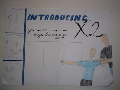
This is the double page spread I created that will hopefully be the one that I use in my magazine.
I really like the general layout of this double page spread because it looks quite original and I haven't seen articles that look like this. The colour scheme I am using here still uses the dark blue seen on the front cover and contents page, but also uses white because that is a light colour that isn't too loud but can also be associated with hip-hop. Black is again also used for all the text because using those three colours leaves the double page spread not looking cluttered and also has a nice effect.
The layout of this double page spread is interesting because of how the images have been placed. The big main image has been placed in the bottom half of the right-hand side of the page. It looks like the artists are creeping out from the side of the page which I think looks good. The arm of the artist is extended across the area where the interview will be placed however because the arm is light-skinned, the black of the text will be layered over it without affecting the look of it. The title of the double page spread 'Introducing X2' takes up most of the top of the page, without looking too empty. I like the clash of fonts with the block style of 'introducing' being layered under the calligraphy style of 'X2'. The three images on the left-hand side of the page create the look of negatives of developing photos which i like. Also in the three boxes, the artist are doing different poses which is easily portrayed without taking up too much space. For my double page spread I didn't use much inspiration from other hip-hop magazines, the most i took from it was the simplistic, ordered layout and that was about it.
No comments:
Post a Comment